A font for the future

Vazeh Font

In Vazeh Font, the goal is simplicity, quick transmission and correct understanding, and most importantly, education to the young generation, which is compatible with the Iranian spirit in addition to ease of reading.

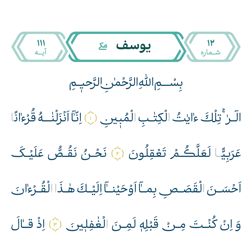
About Quran Vazeh Book

About Vazeh Font

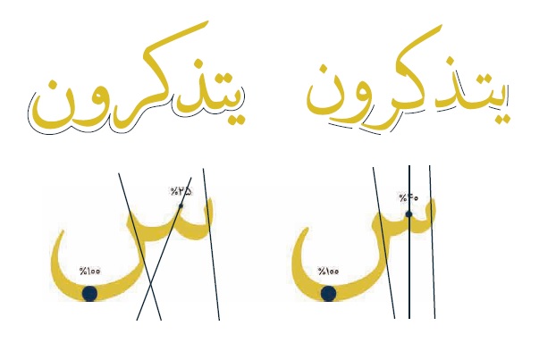
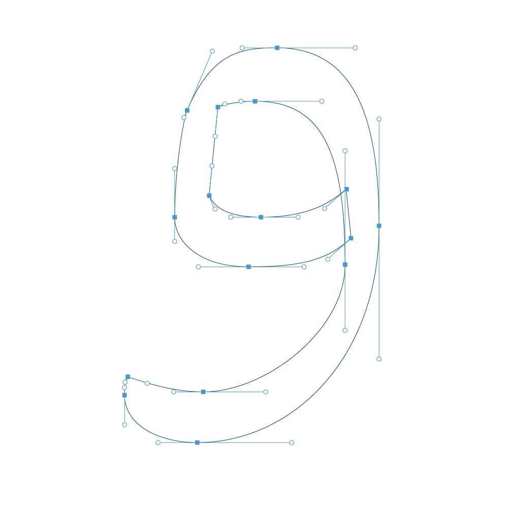
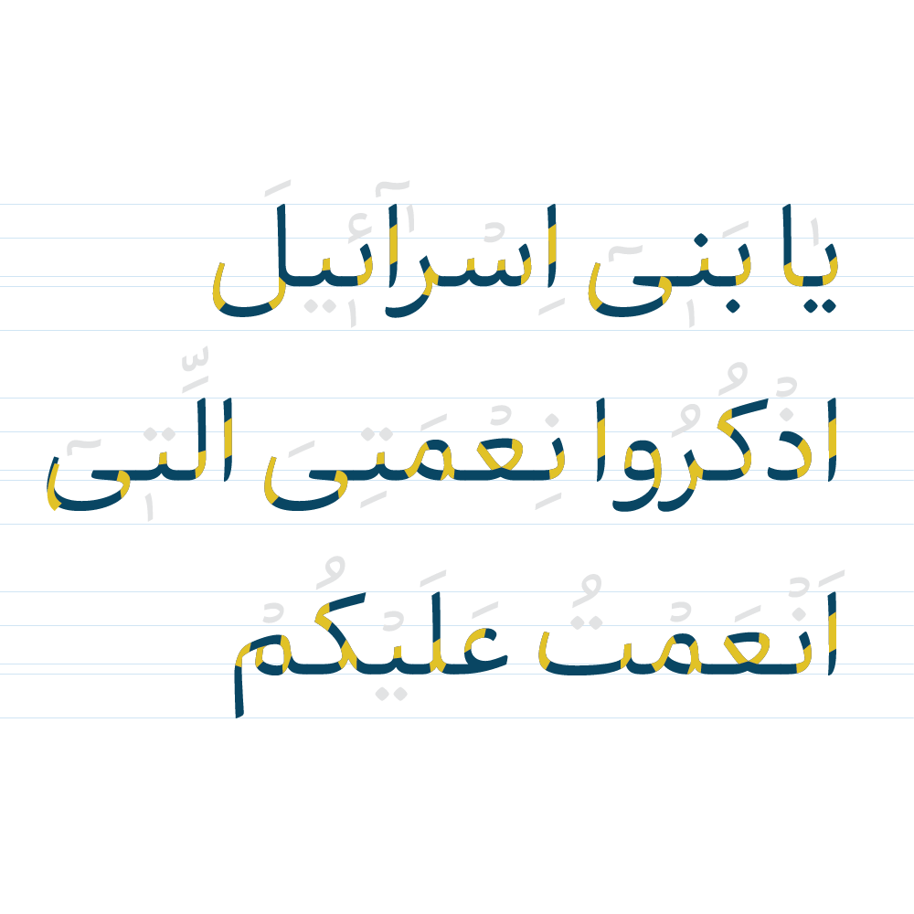
In Vazeh Font, the goal is simplicity, quick transmission and correct understanding of the verses, and most importantly education to the younger generations. In this direction, the effort was to design a font that, in addition to being easy to read, is compatible with the spirit of the Iranian audience and does not have any form of mystery or complexity. Punctuations and Arabic words are designed and adjusted in such a way to increase the speed of reading and understanding of words. Also, in addition to giving importance to the wishes and tastes of the older and traditional sections of the society, together has taken into account the spirit of the younger generations so that the Quranic texts can be easily and simply exposed to everyone.

Download Catalogue
Success Stories

Font Features

Readability and clarity

Readability and clarity

The readability of the Quran is more important than anything else. The “Vazeh” font was designed and developed specifically for this book within 3 years.
Exclusive design of each letter (more than 500 characters).
Typography and Arabicization of word in Quran (more than 21 thousand words).
A simple, modern, unique and compatible line in the digital space.
Calligraphy design based on Iranian art and the taste of Persian speakers.
The font won the TDC award from America (the most prestigious international font award in the world).
Modernity and simplicity

Modernity and simplicity

The Vazeh font has taken into account all the possible criteria for simplicity and correct communication with the audience, as well as a modern look at the design and structure of the font.
Regular angle of characters
Open spaces and crotch
Recognizable letters
Control of cuts and joints
Low or medium contrast
Somewhere less seats
Appropriate use of the surface
Based on Persian calligraphy ، art and beauty

Based on Persian calligraphy ، art and beauty

Presenting a product that is in harmony with the Iranian taste and the art and authenticity of this Persian history and culture and attracts the attention of the Iranian audience is a standard that the clear font carries with it.
Soft cuts and use of curves
Serenity and simplicity while charming
Low pen angle and maturity and avoiding emotional movements
Vertical orientation of characters
Follow the natural movement of the hand
History and formality

History and formality

Understanding the Quranic history and preserving the authenticity of the Holy Quran in presenting a new way in Quranic writings is an important feature of the Vazeh font that shows the completeness of this product.
Maintaining strength and weakness
Having a thickness contrast
attention to calligraphy (historical)
Heaviness, sobriety, less playfulness
Open bowls, and induce a sense of heaviness
Touch pen movement and citrus drawing
Suitable for digital and pixel space

Suitable for digital and pixel space

The Quran Vazeh font has been designed and rewritten by the best designers many times over the course of 3 years; User needs in the digital space are well known and easily accessible.
Few details
Avoiding many weaknesses
Angles in the direction of the coordinate axis
Attention and use of the surface
Open spacing and maintaining frontal proportions

Combine seamlessly fitting layouts

Check our Recent photos from Essentials Portfolio

By clicking on any image, you will be transferred to the page of that image. On this page, you can show your interest in that image by using the “Like” button.